Tuesday, 8 May 2012

Picture Lock and Colour Correction

I asked the producer to organise a meeting for Monday to discuss the final edit and make sure that everyone in the group was happy with it so I could picture lock it for James. Unfortunately, myself, James, Rhys and Jess were the only people to turn up. Myself and James had already looked over it so it was Rhys and Jess who checked through. I was a little unhappy because I wanted the director to be there so I could definitely picture lock it and James would have more time. Instead, I waited til today to put a final picture lock on it. Watching it back today with the director, James and I decided that a reaction shot of the father after he had pushed his daughter seemed a little out of place and we realised it was because his emotion was not present. So, to remedy the situation we cut in the pills on the floor as we couldn't cut between her falling and the first shot - it looked jumpy and out of place.  However, I feel that it might be a little too in your face about the pills now. At least it is better than it was previously.


The rest of the day was spent colour correcting which James was very helpful with as it was my first time doing it. I think I've learnt a lot about this process now and I began to be able to manipulate the colours alone more successfully with him looking in occasionally to cross check.


Overall, I am very pleased with how my edit has gone and I think I've done some creative problem solving involving cutting around exposure and focus problems whilst maintaining the pacing and engagement of the piece. I am most proud of the argument scene where I implemented a faster cutting pace to create a disorientation which I had started on the rough edit and was encouraged to refine and add more by Esther. I think this has turned out very well - the final scene is also, in my opinion, a strong scene and my decision to keep the shot where he pulls out his phone and apologises before looking off as one long scene with no cutaways increases the intensity in my opinion. 

Friday, 4 May 2012

Fine tuning

Beginning the fine cut today, I was very happy with how things were beginning to look. I am trying to get a picture lock by Monday at the latest so that James can begin work on the sound. He has been sitting with me during editing and I've really appreciated his input. 


There was one minor hiccup where we noticed that the letterbox bars were grey and this meant that the formatting was off on these sequences. For some reason, there were some grey letterbox bars on only some of the sequences and not others, so we spent a fair amount of time redoing the sequences with correct formatting. We checked the in and out points of the clips and had to use these to get the same clip into the new sequence. 


Aside from that, things appeared to be going well - I cut out a lot of the exposure problems and tried to be a bit bolder during the cut. I held the last shot that Esther had recommended and gotten rid of the shot that had been there previously as this seemed more poignant.


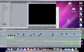
 I tried out the quick cutting in the argument and I really like how that's turned out, pictured below.


Thursday, 3 May 2012

Tutorial

Esther came up with some really helpful recommendations for the fine cut which I think we will be considering and most likely implementing. 


First of all, she mentioned that the quick cutting during the argument could work better if there were more of it and that we should trial it out to see if it would work. I am quite pleased because I did want to take it in this direction. 


Secondly, there were some shots she mentioned that could be removed which I think could definitely benefit our piece. I was reluctant to remove them originally because I was unsure if cuts would jar or not but I will try removing them. This includes the final shot which Esther thinks should be changed from the current one to the shot a few seconds previously. At first I didn't notice but I think that's because I was used to this sequencing but now that she's pointed out how different the emotion is, I can see how much more poignant and emotive the piece could be if we held on that shot and got rid of the end one.


There were some points that I don't think I can do anything about because they are holding on shots but either the shot doesn't hold or the actors don't continue acting whilst the camera is still rolling. 


However, these are minor problems and I don't think they will be too much of an issue in the finished film.

Wednesday, 2 May 2012

Rough Cut

The rough cut has been completed and I'm fairly happy with it. There are some scenes which I think need tightening and I'm not entirely sure about transitions but as yet, there are no sound provisions but a guide track so I'm thinking there may be room for sound transitions. We have discussed using fades or cut to black in between passages of time but I am reluctant to do so unless there is further reasoning behind it. 


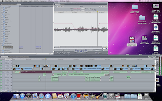
 The above shot will need colour correction and I plan on tightening this sequence after our tutorial. Below is some of the quick-cutting I did during the argument scene. Unsure of whether it is working or not so haven't done a lot of it as yet.

I am unsure about some of the shots that are included because some are soft focus where there is no other footage including the dialogue needed that I could cut to - i.e the father holding the flowers. 

Tuesday, 1 May 2012

Assembly

Most of today's tasks were to convert all of the footage via Mpeg Stream Clip into Apple Pro Res 422 which took a very very very long time! 


However, I still managed to put together an assembly of the scenes which gives us an idea of timings and structure. There will be a lot of cutting involved for the rough cut but at least we now know that the scenes are put together and can begin to think about pacing during the rough cut.


 For example, the shot above is over exposed so I'll need to find a way to cut around it without including it in the final piece - do I need to show them sitting down to dinner or can I cut to the dinner table without jarring?


Above is a problem I encountered and couldn't quite figure out why I was encountering it! I had to create a new sequence in order to rectify the problem.

Monday, 30 April 2012

Footage

Today I looked through the footage from the two shoots and was generally happy with the footage. There was a lot of footage but not a huge variety of shots and I didn't really have many cutaways that could be useful. There are a few exposure issues and some soft focus problems but I should be able to resolve this by cutting around them. Having said that, I am confident there is enough coverage to cut together a coherent and hopefully emotionally engaging piece. 

Sunday, 29 April 2012

Filming

Filming was scheduled for Saturday and today, I went to the Saturday shoot because that was the day with the most planned and Lewis had to leave early for work so it would be helpful if I was there to strengthen the numbers. Mostly, I helped out where needed - getting props, holding the bounce card when needed and doing the clapperboard. I felt that the day went quite well but we did run over schedule a little and I noticed that we were moving fairly slowly during the first scenes.

I get my hands on the footage on Monday so I can begin looking through the rushes and labeling everything.

Thursday, 26 April 2012

Rehearsals

I also attended the rehearsals as asked, it was during the rehearsals that I suggested Natalie use the camera and new shoulder rig for practice shots - thus removing most of the crew from the rehearsal room leaving  producer, director and actors which I felt was much better and an easier environment for the actors than having the entire crew present all the time. Once I'd helped Natalie with the test shots, we went back and watched the final run through for the evening. 

Monday, 23 April 2012

Auditions And Actors

Today we held auditions for the daughter character which I attended as asked. I felt that the auditions went well but the girl I would have most liked to play the part was the least available. Also, it was a difficult choice because the crew and producer had to make the decision as Lewis had to leave due to work commitments. 

Monday, 16 April 2012

Marina Abramović

Above: performance in "The Artist is Present"

Marina Abramović staged Rhythm 0 in 1974  and is known as a performance artist who uses her body as canvas and pushes things to the limit. 


I admire her work because she tries to explore different boundaries through interaction with often dangerous objects. I first read about her more recents endeavors entitled The Artist is Present in 2010 which featured her sitting immobile and silent whilst spectators could take turns sitting opposite her. This provoked deep emotions from audience members who often cried when confronted with the silent artist.


As I became intrigued by her interactive art, I read about Rhythm 0 which I found both inspiring and bizarre. Assigning herself a passive role and allowing the public to have access to those objects with no control over what they might do is a very interesting act of trust; the public started timidly but soon began to act aggressively whilst she remained impassive which resulted in rose thorns being put in her torso and a gun held to her head. She put herself in a state of complete vulnerability and I think this is a very interesting state to explore as an artist. At the end of 6 hours, a predetermined amount of time, she began to move toward the audience and they reacted by running away to avoid confrontation. I find the concept of running from consequences to your actions, especially actions that are taken against a passive individual very thought-provoking. 


Most of her work involves some level of pain or tests of limits and boundaries, especially endurance but provide interesting reading because her conclusions from each leads her onto her next performance exhibit. Specifically, after Rhythm 10 she began to wonder about consciousness of the performer and this lead onto Rhythm 5 and Rhythm 2 which both explored this theme. 


Overall, I find this artists work very inspiring because of her willingness to try things in order to discover a final conclusion. I think I would be very interested in portraying vulnerability through video mediums in further projects.

Thursday, 12 April 2012

My Name Is Lisa

Whilst we were discussing our ideas on Skype, I remembered a film I'd seen that was similar to some of the concepts we were coming up with in our discussion. I re-found it and sent a link to Rhys so that we could decide if some of it's styles could have an influence on our final piece and to make sure that we weren't too close to the storyline of this film.

 This short film deals with a mother who has Alzheimer's and her slow decline whilst her daughter has to live with it and come to terms with what's happening and how it's affecting their relationship. The film has some comic moments and the characters share laughter at the beginning but as her mum begins to forget more important things, we see how it has an affect on her daughter with the film culminating on her mother forgetting who she is.
 The film uses repetition of scenario's and shots to effectively show the audience who often this occurs and how it's becoming worse in a short amount of time. The shots above and below show how her mother slowly gets worse at forgetting what she's doing and Lisa having to sort out what she leaves behind. The lighting is always bright but it's the acting that focuses us on how it's beginning to have an effect.
  The mise-en-scene is very important in creating the differences in this repetition that show us how her mother is changing. In the shot below, we are used to seeing Lisa and opening with her mum sitting there with a pile of dishes when usually she is walking in with a lunch for Lisa shows us this big difference however, these moments are slowly repeated until this point so that the difference is gradual. The slow differences also show how much the role reversal is slowly coming into effect. In the end, we see Lisa doing all of the mothering things and the mother being looked after.
It's the slow build up of repetition combined with the acting that makes the film so powerful. The direction of the characters and consideration of set and appearance create a believable scenario even though the audience know that the situation is deteriorating at a much quicker pace to fit into the time frame. The appearance of the mother is integral to the audience's understanding of her Alzheimer's getting worse alongside the mise-en-scene as the mother begins with hair done up and co-ordinated clothes that connote to the audience she has considered them but as things worsen,  her hair is put in a pony tail then down and her clothing appears to be less co-ordinated which connote her becoming less mindful of appearance as well as other things.
Overall, I think the film has managed to condense the issue into it's time very well but I think they could have considered the camerawork more carefully as at times it feels as if they've not considered some shots however, they have considered the locked off camera shot as the audience know that in this shot, Lisa is supposed to be making her video diaries and we know that this convention fits with that plot.

As I don't know what direction Rhys and Lewis have gone in with the script, I can't say how much this film will influence our final piece but I hope that when writing the script they take into consideration ways of filmically portraying differences or degrading situations in the time we have from what has been done in this film.

Tuesday, 10 April 2012

Skype Conference

The Skype conference ended up being just myself and the producer, Rhys. I still put forward the ideas that had come from the mind map I'd made and we discussed and idea Rhys had thought of. In the end, we settled on a hybrid of his idea and one of the things I'd suggested from my mind map. Although we started getting into specifics such as characters, plot and script writing as this wasn't my role I decided to have minimal input and gave some ideas but asked that he discuss them with the director, Lewis. My reasons for this were that if Rhys and I came up with the plot, characters and specifics all in one session, Lewis might find it hard to have a vision of what he wanted because he would have to interpret our ideas and I felt that the director should have input on this process. As editor, I think that I need to have input on final scripting and screenplays in case there is anything that could be difficult to cut together if they've left an element out. I intend to ask for a copy of the script so I can make editing notes.

Monday, 9 April 2012

Journey Mindmap


Here is a picture of the mind map I created in anticipation of the Skype conference tomorrow. I tried to think of things that aren't necessarily thought of when someone is given the word Journey so that I could put them forward to the group to discuss if these were something we should consider. Among the ideas that I thought might not occur immediately where the possibility of an animal going on a journey, or an object's journey to it's current place or it traveling through different hands. Perhaps even time as a concept itself, for example a child taking a history class and in his mind traveling to the different periods he's learning about. This idea I decided would be far too complex for a five minute piece but I will still discuss it with the group.

Friday, 6 April 2012

Successful Alcoholics

 This is a short film that takes a comedic look at two 'successful' alcoholics, who seem to be successful through work and having a nice car, etc but are actually alcoholics and don't recognise it in themselves until the end. There are a few funny scenarios that take a lighter view to whats happening but as the film progresses, the viewer see's just how bad they are.
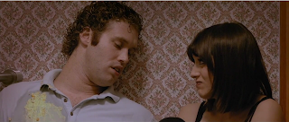
 The shot about and the shot below are in the beginning sequence of the film and situates the viewer in how bad the two characters are but through the comedy of the sequence, the viewer knows that they are very drunk but they don't recognise the extent of the pairs problem with alocohol as the situation makes us laugh. At this point, we are in the same denial as the characters. A lot of this effect is created through the acting which is great. The first time I watched this, I thought the acting was very good on the part of the female protagonist but not on the males but having re-watched it, I think I gave him little credit on my first viewing although I still feel that she is the better actor.
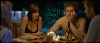
 As the film progresses, we begin to see how much they drink, most of this is done through montaging shots together in quick succession in the same set-up. The picture below denotes their kitchen and although we aren't aware of it yet, the couple are about to go to work. The costume choice for him denotes that a little but because the shots of them drinking are in rapid succession, we think they don't have to be in work, so juxtaposing this with the scenes of them at work really hits home to the viewer just how addicted they are.
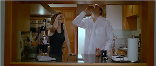
 The mise-en-scene is very carefully chosen and this is apparent. There is always a drink around the couple for the most part of the film, the clothing for their characters are indicative of their success and in the case of the male protagonist, his varying states of drunk behaviour at work - his various co-workers and boss picking up on his state of attire during his working day. In his office at work, he has a calendar behind him with happy hours marked on most days, his bottom drawer is filled with spirits as we find out when he puts them on his desk and various objects line his desk which he obviously finds amusing in his drunken haze, as indicated by his interactions with these. Even in scenes that are chaotic and filled with objects that the pair have obviously strewn around in their drunken frenzies, objects are carefully placed such as the laptop in the sink for plot progression.
Although a lot of the drunken encounters are funny and portrayed in a comedic light, little juxtapositions between shots indicate that the situation is far from funny and indeed beyond what audiences would think were normal. Such as the scene where they are at a bar and exit onto a bright street, obviously mid-morning. The lighting of these shots are contrasting very clearly, the first shot is dark with obvious internal lighting that indicates a bar and the second shot is very bright and stark. The use of a bar instead of a home setting tricks the viewer because a bar is purposefully dark to keep people in for longer as they can't see a change in time through light changes and so the viewer automatically assumes it is night because it is a darker atmosphere. Pictured above and below are shots from this sequence that illustrate this point, the shot below is about to fade to white; the choice of fading to white instead of black separates time without the viewer automatically associating the black screen with a blackout that the characters might experience. Decisions like these show the directors intentions and consideration to the final piece.
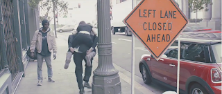
 The shot below is a turning point where the female protagonist first realises that things are getting out of hand. The shot opens with the couple asleep on each other clearly in a car and then progresses to the arrival of a police man. There is some comedy in the exchanges between a clearly drunk protagonist and the police officer but a viewer can appreciate the gravity of the situation. By this point in the film, the audience are attached to the protagonists and so in this situation we want them to not be arrested but this puts us in a place of dilemma as we want them to not get in trouble but we also know that without getting in trouble, they won't know how bad their situation has gotten.
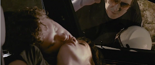
Overall, I think the film is successful as it carefully manipulates the viewer through comedic sequences and juxtaposition into empathising with the characters and therefore wanting them to realise that they are alcoholics. I think the ending is particularly apt and it sobers the audience's mood; this ending asks the audience to think about the film whilst connoting how hard it is to break alcoholism through the decision to not show the audience what has become of the male protagonist. We know that he probably hasn't been able to kick his habit but we don't know where that leaves him and the filmmaker has left us to think about that.

Wednesday, 4 April 2012

I Do Air


This was another short film shown to us on Thursday and it blew me away.  Firstly, the low usage of dialogue given how much you infer about the character without it is incredible. The movements of the actress are very telling about the protagonist in the absence of speech and the entire film gives the feeling of escapism. In fact, the underwater shots (one of which is seen below) are a huge part of this escapism; the lighting is brighter underwater and the bubbles that are on-screen do much to enhance a day-dream like feel.
During the scene where the protagonist is stood on the top diving board, certain diegetic noises are brought into focus which shows the fear and intensity the protagonist is feeling whilst stood there. Each noise makes the viewer acutely aware of the surroundings and makes the atmosphere on that ledge claustrophobic despite the open space we're seeing when we look at the surrounding pool. The camera work compliments this feeling with close-ups of the girls face juxtaposed with the space all around her as seen below. All of this builds so that when the girl takes a breath and all of this noise is shuttered out, even for just the moment she is holding her breath, the viewer feels the intensity release for a moment of relief before it all comes back when she lets go.
In the sequence where the protagonist enters the changing room, sound is used very carefully. The noise of the hair dryer and baby, alongside the incessant talking from the two women creates the feeling of not being able to escape and so when she holds her breath again, we get another sense of relief. I think if i were to pick fault from this film, the shot where you see the girl floating with her hair over her face in the mirror would be where I would look. To me, it feels as if it belongs to another genre and that it doesn't particularly fit in with the feeling of relief that is being created.

Non-diegetic music is used sparingly, so when it is used in the ending sequence where the girl is underwater with the two swimmers, it creates a happy atmosphere and the sense that the protagonist has finally found a way to escape her fears and the world around her. I commend the director for holding the music back until this moment as it makes it more momentous to a viewer and it's calming tones make us feel that the protagonist has found a peaceful moment.
Overall, I think this film is very well considered and realised as it creates the sense of a character through no speech from the protagonist and uses sound really carefully to build atmosphere, tension and feeling within the character that the audience can pick up on.

Tuesday, 3 April 2012

Screenings from Thursday

I planned to do a detailed analysis of one other film from Thursday but today I decided to briefly discuss the rest of the films we saw.

The Pudding Bowl - Vanessa Caswill
 'The Pudding Bowl' was colourful with soft lighting and featured simple non-diegetic chords to engage the audience, especially in times of dramatic effect such as when the protagonist runs to the mirror. The close-ups employed are used to connote the careful nature of the girl and juxtaposes the action which denotes to the mother that the girl has spilled glue in her hair, the audience seeing how careful she is and seeing the brother do it know that it was not her. This effectively puts the audience on the side of the little girl and creates empathy for the character.

About a Girl - Brian Percival
'About a Girl' builds character and development through a monologue but the lighting and mood of the scenes also does a lot to foreshadow events and juxtapose the ending to the beginning. Whilst the protagonist walks down the canal side, the lighting is bleak but in other shots, it is brighter. This has the effect of foreshadowing and also showing what has happened to cause what happens at the end. The lighting is reinforced by camerawork, a locked off camera is used for the past and hand-held is used for the present. I thought the piece was slow paced but it suited it for the twist at the end.

Audiotour - Stephane Kaas

At the end of 'Audiotour' as the protagonist takes off the headphones, the diegetic sounds of the world around her are faded in; this denotes that she is now emerging from her immersion in the audiotour and facing it's description of her. The lighting throughout the piece is light and connotes knowledge and exploration. The main focus is the protagonist's journey of discovery through the city and finally of herself through the eyes of the audiotour, this means the protagonist has very few characteristic developments and focuses the audience and on the plot.

Rite - Michael Pearce
In 'Rite' we see a reversal of roles, the father only wants to please his son. This is clear with the lengths that he goes to, even if he doesn't know his son well enough to be able to make it work. The acting is restrained and there is good tension. The director has considered the ending well, not hearing the music from his son's ipod as the viewer and not taking us into that point of view made the film all the more poignant.

Le Miroir - Pedro and Ramon
At first, the film is sound oriented, we don't see very much until we arrive at the mirror. This film is POV and once the viewer grasps the concept, they do not get bored because each transition carrying from one age to the next is different and new. There is very little outside view of the mirror and the filmmakers have limited themselves with this however they have been very clever in keeping the viewers interest. The lighting changes with the protagonists mood and the viewer can tell that it is the same protagonist aging due to the idea of having tattoos. Overall, this film is well created and realised considering that the concept is easy to grasp so the filmmakers have had to do more to keep the audience immersed. 

Monday, 2 April 2012

Alma


Alma is a short animation that seems cheery and delightful but soon changes to become very eery. I wouldn't recommend this to anyone who is scared of dolls as this animation would definitely only make that worse. For this reason alone, the film is a success! However, there are many elements that make this short stand out to me and make it successful in my eyes.
 The attention to lighting is very important to the overall atmosphere of the two spaces, the outside being light and free and the inside dark and oppressive as shown above. The music is instrumental in this too and is a happy accordion to begin but slows to a more creepy sounding accompaniment. The sound is all diagetic aside from this and there is no dialogue yet we can instantly tell each emotion of the child through her movement and expressions on her face.
The above shot is part of the drawn out sequence of Alma reaching out her hand for the creepy doll which keeps the viewer in suspense, wondering what will happen when she finally reaches and strengthening our empathy with Alma.
The shot below is a brilliant way of showing how Alma has been trapped without showing anything explicit such as being sucked into the doll or disappearing which leaves the mystery and intrigue of how she actually got inside the doll open. It also gives the perspective of the doll from the shelf and a feeling of claustrophobia and being trapped by the physical line around the edge of the vision. The next shots are of the dolls face and it is connoted that she is feeling trapped by the eye movement that the animators have done so well.
The piece ends with another doll appearing by the window and the viewer feels chilled to think that our protagonist hasn't escaped and this could happen to another child. After watching this short, I saw a comment on the video which suggested that Alma meant 'soul' in Spanish and another suggesting it meant 'Don't touch' in Kazakh. This consideration of the film-maker to choose a related name shows that each detail has been carefully considered and this is apparent in the mise-en-scene also.

Overall, this short animation is both clever and scary and manages to provoke a reaction from the viewer. I think this is down to great realisation and ability to create an atmosphere.


Saturday, 31 March 2012

Sign Language


This short film was shown to us during the screenings session on Thursday and my first feeling was that it was quite a documentary style approach to a drama! The voice over coupled with the visuals gave this feel but some of the close-up shots broke the feeling of documentary. The mise-en-scene is well considered, you can tell that these people have worked on the street for a while as they all are wearing the appropriate outdoor clothing and this denotes characterisation as well in the case of the rainbow gloves that link our protagonist and his love interest. (pictured below)
 The narrative is the driving force in plot and character development, we find out all about our protagonist and the others that work around him from his monologue. The voice over coupled with the hand-held, close up shots create an intimate feel, as if we are there with the character as he continues about his job and the busy street atmosphere can be echoed in this too, quite close to people you don't know on the street.
 There is music present throughout the entire piece and this links everything through nicely, the music is very laid back and calming, a few soft vocals coming in and out of the chords which is put together nicely with the action. Alongside the music, the diegetic noise of the street is always present so when it fades away during the ending sequence the audience notices that this is an important event for our protagonist (pictured below) and the subsequent action he takes is more important to a viewer.
Overall, I think this is a very well put together piece. It's a nice marker to see how much you can discover about a protagonist and characters in the sort of time that we will have for the drama project. The music and diegetic noise is well considered and suits the tone of the piece and the camera work allows the viewer to feel more involved.

Thursday, 29 March 2012

Drama Brief

Today we were given the brief for the drama project. I am working with mostly the same people with the addition of Jess and we have all taken on different roles from the previous project. I will be taking on the role of editing and to prepare myself I plan to read Walter Murch's 'In the Blink of an Eye', which I had started reading during the term but hadn't managed to finish before I had to return it to the library so this time I plan to take it out of the library to read and reread it as much as I can.
I am also going to make sure that I stick more to my own role this time, as in previous projects I feel I've been taking on too much of other roles; I still plan to lend a hand now and then but I will to stick to my role as far as possible. I am going to ensure I go to all production meetings as I know that as an editor it can be very important to put in ideas if I think there won't be enough cutaways or footage that has been considered for edit. The whole piece must be considered for edit during the pre-production stage and I plan on making sure that the director and producer are keeping in mind my role whilst they are planning so that when it gets to my stage I don't have to cut for continuity and cut around problems and can cut for a polished considered piece.

Tuesday, 27 March 2012

A Question of Time

 A Question of Time -  Radoslaw Sienski

Above: Shot from opening sequence

This award winning short film was made by a student film maker and won Best Short Film at the 2nd annual Soul 4 Reel Film Festival 2011 and was a winner at Campus MovieFest 365, London 2011. I found it on youtube in two parts which can be found here and here.


The story telling in the piece is very clear and you can understand the various moods throughout the film but at times I wonder if the same feeling could be gotten from fewer shots or from less off-screen time because I think that the first half of the film has a slow pace which although it doesn't necessarily detract from the piece, perhaps the film could have been more engaging if it had a faster pace in general. Periods of time are denoted by captions which are suited for the piece dealing with it's time traveling nature and also help to locate the viewer in narrative time, which is particularly important in a short film. The use of on-screen text helps to create a sense of atmosphere because the characters do not have to speak to denote to the viewer at what point in the film they are, so a moody silence can be maintained where needed and I think the director has considered this carefully to the pieces credit. 


An overlaying of images flashing quickly between each and over each other with altered opacities can be seen during distressed periods, the first example is after Oliver is hit by the car and another example is when Mark fastforwards his watch to 25 years in the future. These segments give the effect of disorientation and distress which is strengthened by the change in the music that is present throughout the entire piece which combined with disoriented noises and flashing imagery makes the viewer feel the same as the protagonist. 


Below is a shot from the second half of the film that I find particularly clever. It depicts the watch turning back time as the protagonist can manipulate time with it whilst the clock face of Big Ben corresponds to the protagonists changes. This shot is integral to the piece because it makes the viewer believe that this is actually occurring; it also makes the shot appear as though it is all in one smooth motion and not broken up by obvious time tricks that audiences are so familiar with now that if badly executed can ruin the verisimilitude of a piece. This shot in fact increases the verisimilitude because of how well created it is and the shot also helps denote an obvious setting in the world. 


Unfortunately, the film is let down at times by how distant the voices of the characters sound, which makes the verisimilitude the director has worked so hard to create a little less effective and some of the sound effects aren't very convincing which also lets the piece down. An example of this is the pub background noise in the second half of the film, where the protagonist is sitting there and the radio in the pub comes on but it doesn't sound diagetic along with the general noise from other patrons. It sounds as if it is not located within the scene. However, these are only a few moments in the film and so the viewer won't find this too distracting.


At the end of the film we find out what the inscription means that we see in various close ups throughout the film and it reinforces the point the film is trying to make. I feel that it ties the entire thing together nicely and creates a definite end to the piece whilst also inviting the viewer to think about the film. Overall, I think this short film deserves the awards it won as it is a very well executed concept that is interesting and provokes the viewer to think about it afterward.

Thursday, 22 March 2012

Feedback

Having done our presentation this morning, I'm very pleased with the outcome, even watching it back on the big screen was satisfying despite some of the technical issues with the piece.

It was really nice to get some critical feedback as well as the rewarding good feedback. The group commented on the use of the music played by the musicians as a good underlay and also mentioned the recording quality was good. They liked the sound bridging over the piece and said this helped to create a flowing piece. We got good feedback on the use of the public interviews, they were used to effect and helped bring our piece together as well as some comments on nice transitions, saying the documentary was well paced throughout.

Esther and Debbie thought that the piece was charming and engaging, commenting on the structure being good with well thought out choices of which quotes we included. There were some mentions of inconsistent dialogue levels, which on hindsight were more obvious than we'd anticipated and the intro and outro were appreciated.

One criticism that I would definitely take with me into my next documentary project is to ask the contributors to introduce themselves and what they do as this could have benefitted our piece but I think that without them, the piece doesn't suffer immensely.

The main issues were the grain and some of the framing of the piece but this couldn't be helped in the editing stage so we will just have to accept that criticism and take it into consideration during the next production.

I'm very pleased with the feedback, I think the positive feedback reflects our input into the project and the criticisms are things that we were expecting and can learn from in the future.

Wednesday, 21 March 2012

Evaluation

I'm really pleased with our end product, aside from some of the flaws. I think it's a reflection of the hard work that we've put in and specifically the editing that has pulled all of the footage into a neat structure.

I have learnt a lot about documentary filmmaking, it's the small things that you don't consider when you start that are the most important things. If I was to do the project again, besides other things, I would get all of the performers to introduce themselves and what they do and I'd make sure that the interviewer was always at a fixed point from the camera on the same side so that the interviewee's have a similar point of focus. I think however, we got wide variety of people that means our documentary gets a multifaceted view and the viewer doesn't get bored with the same two faces, but rather sees three or four regular faces and some cutaways to others.

I think the team worked well together, especially since each one of us assumed some aspects of the directing that there was a definite lack of. I feel as though James and Rhys worked particularly hard in their areas and Natalie took up the challenge of being put into a group mid way through and still managing to find her place in the production team - she was a very valuable asset to our group and brought some interesting ideas as well as an assisting hand. Lewis got some very useful close-up cutaways that we could use - especially the shot of the guitar being tuned, he saw the opportunity and asked the band members straight away which got us a very clean shot to cut to.

I feel that my contribution was valued by the group, and I felt heavily involved through every stage of the production. My main duties were organising the schedules, organising the interviews and conducting them. On the day, I got permissions of performers and public. I feel that I've tried to keep everyone on task throughout the entire process and I completed a lot of the production documentations. I gave input on how we should structure the piece and spent a lot of time with the editors during the editing process. Overall, I enjoyed the role even though I found it stressful at times because in the end it's very rewarding to see the production through from beginning to end and be a part of it in all of the stages, no matter how frustrating these stages can sometimes be.

Fine Cut

Despite our differences in opinion of structure at times, I think the group worked well to choose a range of shots and interesting dialogue to make up our documentary.
The sound was dipped at points to allow the interviewee to be heard clearer and louder over the music they were playing underneath as shown here :

Once we were happy with the structure, James went through and tidied up the visuals using a little colour correction and effects such as fades and Rhys went through and cleaned up the aural areas that needed a little cross fading or tidying.


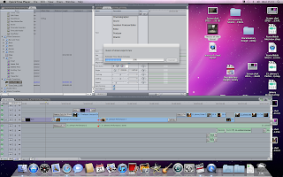
Below is a picture of our exporting process, we had one problem when it exported into 4:3 but we soon fixed this issue and we're pretty happy with the overall finished work.

Tuesday, 20 March 2012

Edit Logs

Having not done an edit log before, we weren't sure what had to be included but Natalie took on the task well and here are the edit logs she created for us:


Monday, 19 March 2012

Sound

Today, Natalie, James and I met with Rhys to incorporate the sound into the piece. Rhys had transcribed the interviews (pictures below) and this proved very useful as Natalie and I could begin to narrow down which elements we wanted to put into the piece whilst James and Rhys worked on syncing up the sound to the imagery.
(Double sided transcripts!)
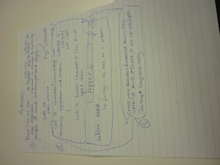
(Restructuring written concept)

There was a slight problem in that the sound was recorded in some instances on the marantz independently of the images and the crew hadn't used a clapper or click to let an editor know where to link up the sound. Some of these problems were solved by the actions of the performers (such as a drummer counting in on his drumsticks) but the process was still painstakingly slow and took the best part of 3 or 4 hours.
James began a rough edit but we also began a second sequence so that we might try out the new structure to see if that worked better than James' current one before deciding to continue tomorrow.